 Zudo Works
Dashboard
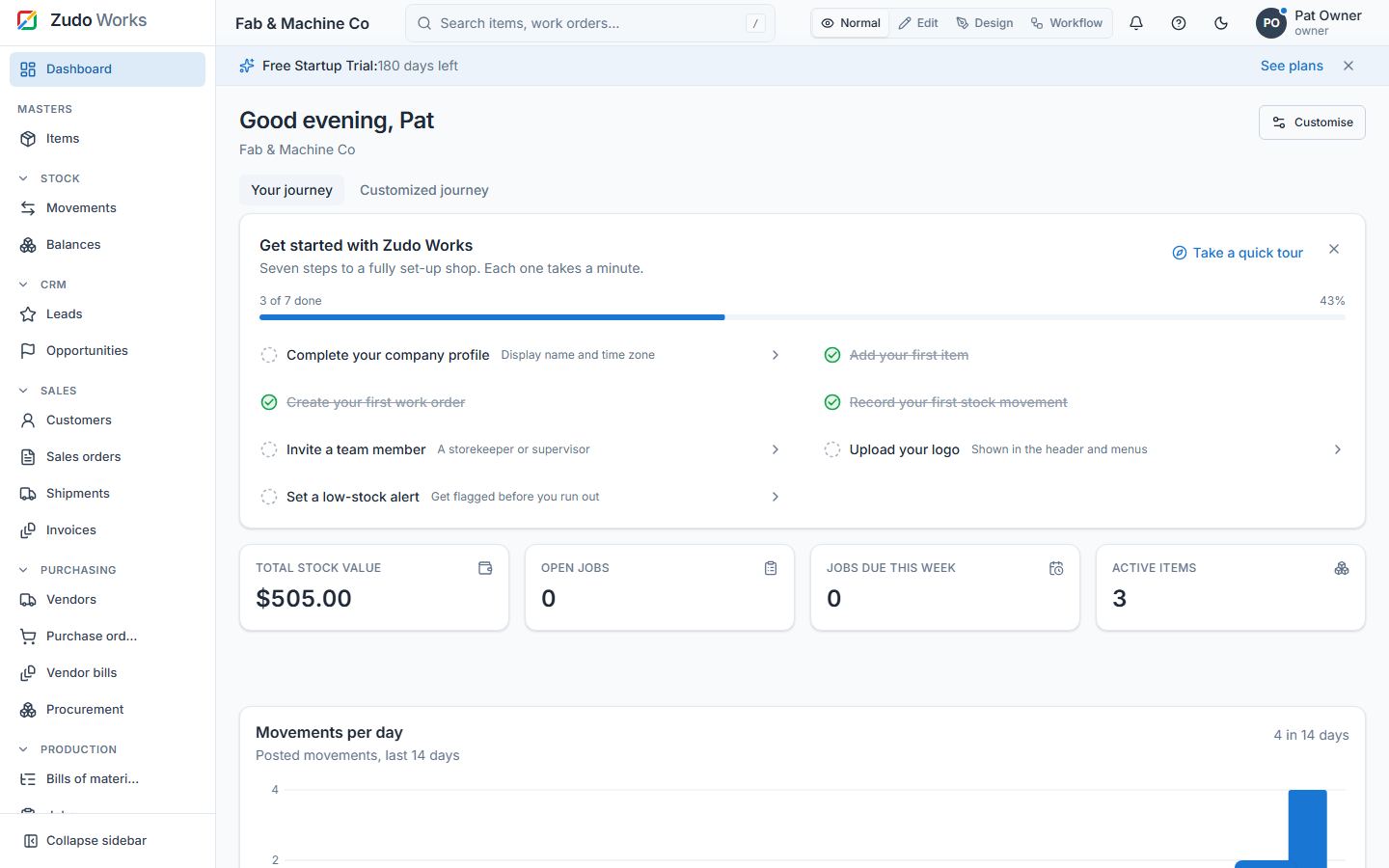
Route: / · Permissions: key figures and charts need stock.read; recent jobs jobs.read; Your journey is shown to users.manage.
| Section | What it shows |
|---|---|
| Greeting | "Good morning, Pat" by local time, with the company name |
| Your journey | The seven-step checklist (and the Customized journey tab when defined) |
| Key figures | Stock value (Σ on hand × moving-average cost), Open jobs (released + in progress), Due this week, Active items |
| Movements per day | Bar chart of posted movements over the last 14 days |
| Charts | Low-code widgets the owner added to the home dashboard |
| Recent activity | Last 10 posted movement lines with item, type, job, warehouse, quantity and time |
| Recent jobs | Last 10 work orders with status |
Customise (owner, settings.manage). Click Customise (or switch to Edit mode): move sections up/down, hide/show them, choose a colour (workspace accent, blue, indigo, violet, teal, green, amber, orange, rose, graphite — a thin accent on the cards), Add chart (any low-code widget), Reset layout, Save. The layout is stored per workspace and applies to everyone. Numbers come from posted documents only; drafts do not count. A brand-new workspace shows Your journey above an empty-state card with "Add your first item".
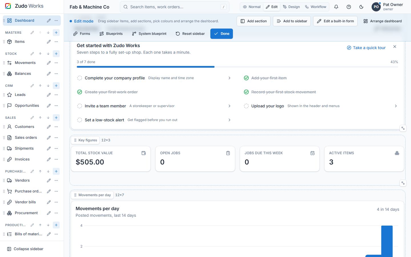
Arranging the dashboard (Edit mode)
In Edit mode the dashboard becomes a 12-column grid. Every section and every chart — pivot tables included — is a box with a handle (drag it to move the box) and a corner (drag it to resize). Boxes never overlap: the others make room and slide up into free space. With the keyboard, focus a handle and use the arrow keys to move it one cell, Shift + arrows to resize it. Save keeps the arrangement for everyone; Reset layout returns to the standard order. The section list above the grid (move up / down, show / hide) still works; using it returns the grid to that order. On phones the boxes stack in their grid order.
Last updated