 Zudo Works
Shaping the workspace
All of this needs settings.manage and is stored once per workspace (everyone sees the result).
| Feature | How |
|---|---|
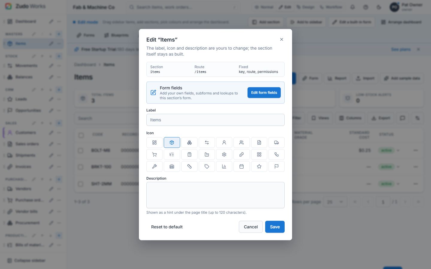
| Edit a built-in section | Edit mode → pencil beside a sidebar link → label (2–30), icon (24 choices), description (≤ 120). Key, route and permissions stay fixed. Reset to default any time. |
| Place a form / dashboard in the sidebar | Form designer or dashboard → Sidebar… → Masters / Stock / Sales / Purchasing / Production / Admin, or a custom section (e.g. "Quality", shown between the built-in groups and Admin). Workflows never appear in the sidebar. |
| Home dashboard | Customise: order, hidden sections, colour, charts; Edit mode drags and resizes every box on a 12-column grid (§9). |
| Journeys | Dashboard → Customized journey → Edit journey: title and up to 12 steps (label, hint, page to open); anyone with settings.manage ticks steps done. |
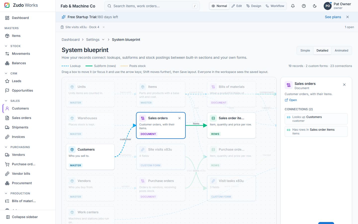
| System blueprint | Settings → System blueprint: a map of how records really connect — lookups, subforms and stock postings between built-in records and custom forms. Simple / Detailed / Animated; hide boxes and show them again. |
Edit mode: the sidebar, sections and the "+" menu
Switch the view mode to Edit (owners). A bar under the header lists the tools — add to the sidebar, add a section, edit a built-in form, arrange the dashboard, forms, blueprints, the system map, Reset sidebar and Done. In the sidebar:
- Drag and drop any entry within its section or into another section (existing or new); a line shows where it lands. The ⋯ menu offers the same moves for keyboards.
- Add section at the bottom; rename (pencil) or remove custom sections. Whole sections move by their grip (below).
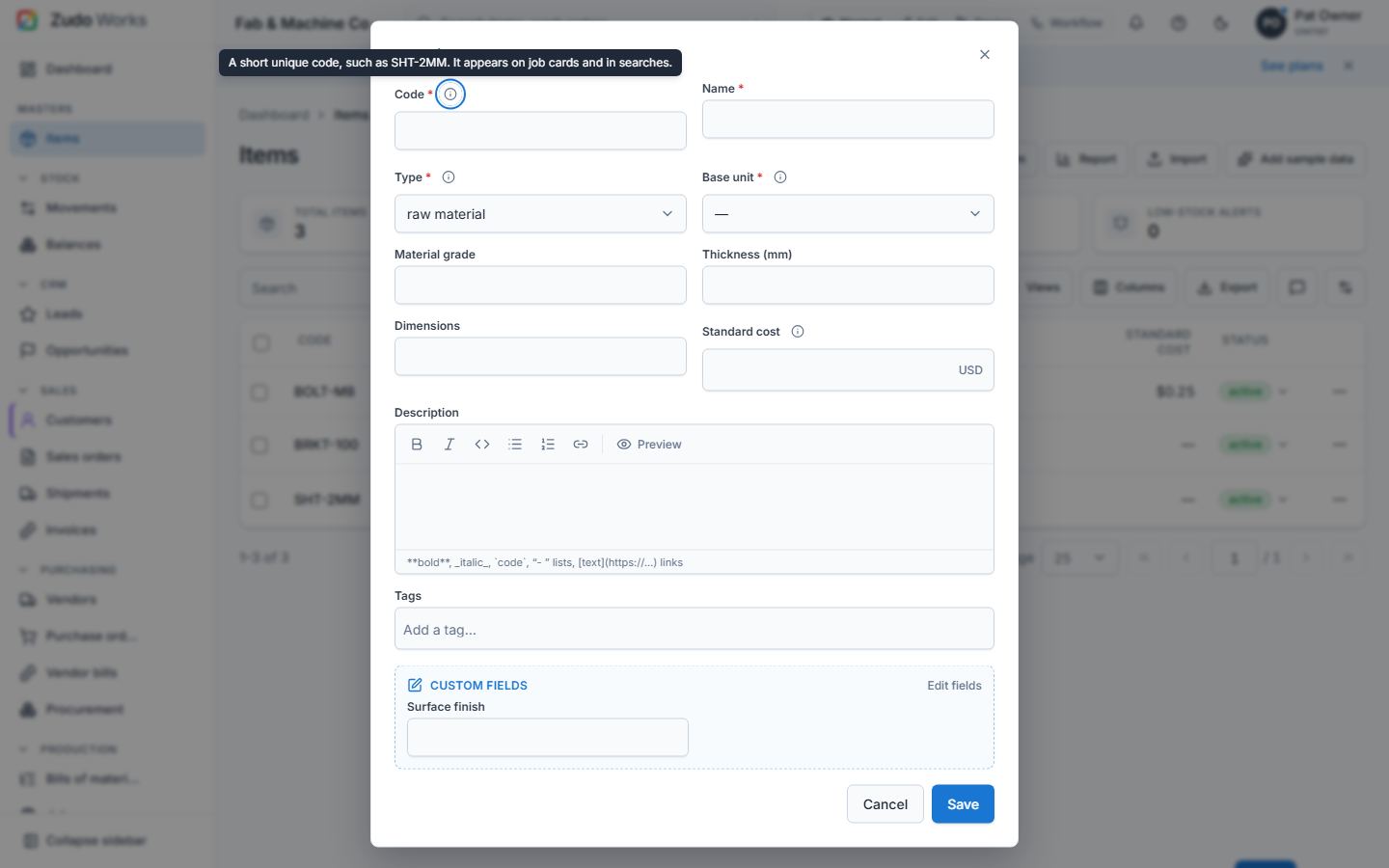
- "+" on a section: add an existing form, an existing report, a new form (the designer opens and the form lands in that section) or a new report (choose a section's data or a form's).
- Sections with more than one entry get a collapse arrow (every mode); collapsed sections are remembered per person.
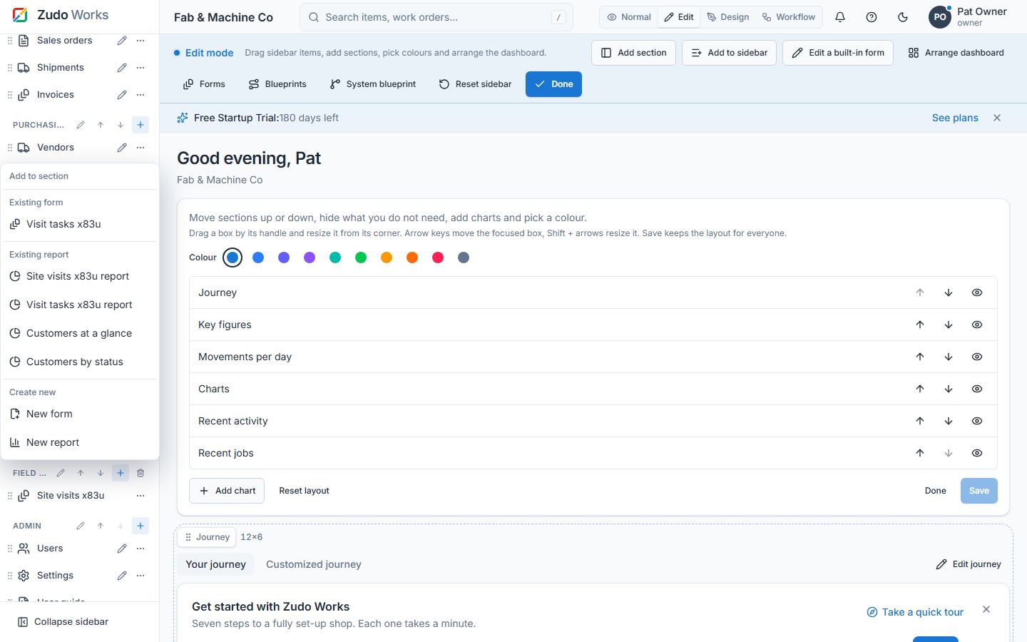
Arrange and hide sidebar sections
In Edit mode every section header (CRM, Masters, Sales, your own sections …) has a grip (⋮⋮) on its left.
- Drag a whole section by its grip — with the mouse, a finger or a pen — like a dashboard tile: the section moves with all its entries, a dashed placeholder shows where it will land, and the sidebar scrolls when you reach its top or bottom edge. Let go to save it for everyone; Esc cancels. The Dashboard link stays on top.
- With the keyboard: Tab to the grip, press Space to pick the section up, ↑ / ↓ to move it, Space (or Enter) to drop it, Esc to cancel. A screen reader hears each step ("CRM moved to position 2 of 9").
- Hide a section: its ⋯ menu → Hide section. Hide one entry: the entry's ⋯ menu → Hide from sidebar. Hidden ones disappear from the sidebar, the collapsed icon rail and the phone menu for everyone, but they still open by link, from search and from shortcuts — hiding tidies the sidebar, it is not a permission (use roles for that). The page you are on stays open. The last visible section cannot be hidden (the sidebar needs at least one).
- Show them again: Settings → Hidden modules (
/settings/hidden-modules, also linked at the bottom of the sidebar in Edit mode) lists hidden sections with the entries inside them and hidden single entries. Show puts each one back exactly where it was; Show all restores everything. Only people who may arrange the sidebar (settings.manage) can change it; others see the list. - Zudo AI can do the same on request ("put CRM above Masters", "hide Accounting", "show Masters again"): it proposes the new order and what it hides or shows, and nothing changes until you approve.
Design mode: colours
In Design mode each sidebar entry and each section header has a colour swatch: pick one of the preset colours or No colour. Entries get a coloured edge and icon, sections a coloured title.
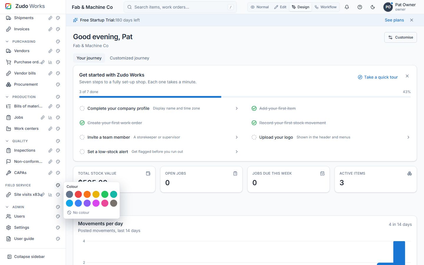
Workflow mode: a workflow button per entry
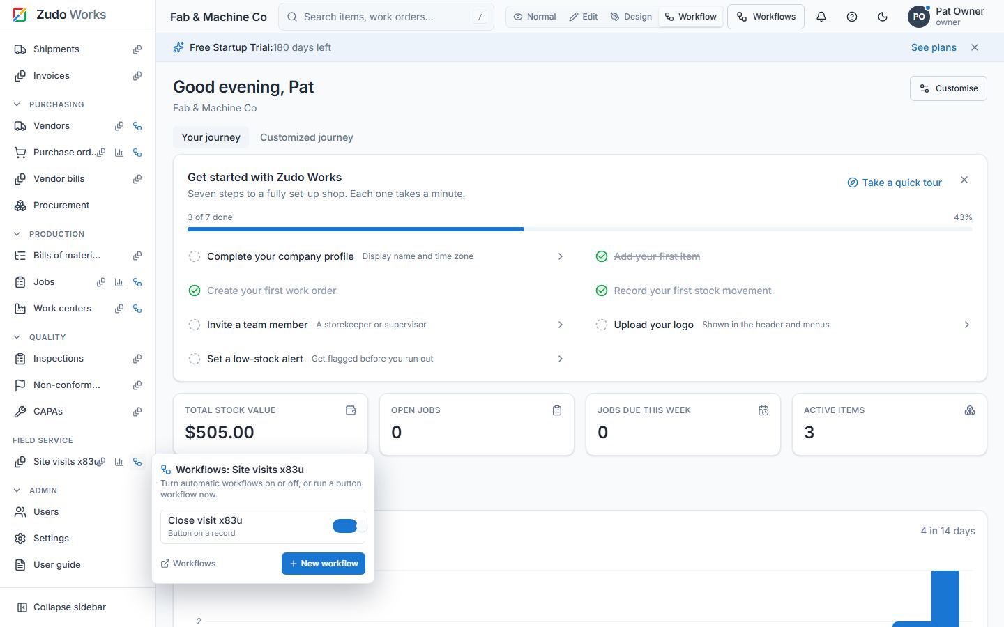
In Workflow mode each form entry and each built-in section shows a workflow button. It lists that form's or section's workflow rules with an on/off switch and links to New workflow with the form or section filled in. A section's own page in Workflow mode shows the same list in place of its records, with New workflow for <section>.
Arrange a form (drag and drop)
Every entry form — Items, Customers, Vendors, Warehouses, Work centres, Jobs, the header of Sales and Purchase orders, and every custom form — uses the whole width of the page: fields sit on a 12-column grid, three to a row by default (paragraphs, tags and line tables take the whole row). In a dialog the form shows two columns, on a phone one.
To arrange a form, open it and switch to Edit mode. The form turns into its designer, one card per field:
- Drag a card anywhere, like the boxes of the home dashboard; the other fields make room.
- Drag its right edge to make it wider or narrower (1–12 columns). With the keyboard: focus a card, the arrows move it, Shift + left / right change its width.
- Add section puts a heading across the form; type its title in place, drag it between the fields, remove it with ×.
- Add field creates a field at once (label, type, required, the options of a choice field): it is a custom field of the section — saved with every record, a column of its list and its reports — and lands in the first free spot. Lookups and subforms are added in the full designer.
- The bin on a custom field removes it for good (after a confirmation, with its values and every report column that used it). The eye on an optional built-in field hides it; hidden fields wait in the Hidden fields tray below the cards — click one to show it again.
- Save layout keeps the arrangement for everyone in the workspace; Reset to flow goes back to the default order; Cancel drops the changes and leaves Edit mode.
Built-in forms need settings.manage to arrange (adding or removing fields needs forms.design); custom forms need forms.design. Built-in arrangements are stored in the workspace UI configuration (layouts.<section> of PUT /api/v1/ui-config), a custom form's in its settings (settings.layout of PATCH /api/v1/forms/:id). A layout is { boxes, sections }: a box { x 0–11, y, w 1–12 } per field key — the built-in key (code, standard_cost), custom:<field id> or section:<id> — and the section titles.
Custom fields on built-in sections
The built-in forms can be edited completely, not only renamed: Edit mode → pencil beside the section → Edit form fields. The section's own extra form opens in the normal designer: add fields, lookups, subforms and field access. The fields appear among the built-in fields of the section's form (items, customers, vendors, work centres, jobs and the header of sales and purchase orders; a block below the form elsewhere) and are saved with the record. In the designer's Built-in fields list the custom fields show in their place — drag one (or use the arrows) between the built-in fields to decide where it sits. A palette click adds a new field right after the selected one, not only at the end.
Entries open their form. Tapping an entry in the sidebar (Items, Customers, a custom form, …) opens its form to fill in, with nothing else on the page. The records are one step away: hover the entry and press Report (the list with every column, filters and the saved reports under its header), or close the form — the records come back on the same page. The Form and Saved reports buttons on every list page work as before.
Custom fields are columns everywhere: the section's list shows them (switch them on or off under Columns, sort, filter and export like any column), the quick view beside the list lists them under the built-in values, and table reports, charts and filters over the section offer them like built-in columns (ext_<field> in the API). Text, number, date and choice fields can be edited in the cell or through Edit field… on ticked rows. A field you add is a column the moment the form is saved; a field you remove is taken out of every saved report and chart that used it (filters, columns, sort and grouping are dropped, a chart grouped by the field is removed), and the values already saved on records stay until the field exists again.
The system blueprint map
Settings → System blueprint (/settings/blueprint) draws every built-in record and every custom form as a box, and the real connections between them as lines: lookups (a sales order looks up a customer), subforms (a sales order holds its items; a form-backed subform links two forms) and stock postings (receiving a purchase order and issuing to a job post movements). Hover a box to light up its connections; click it to list them and open the records. Owners can hide boxes and show them again.
Arranging the map (owners). Drag any box to where you want it — the lines follow it — or focus a box and move it with the arrow keys (Shift moves five steps). Boxes snap to an 8 px grid and the one you moved last stays on top. Nothing is kept until you press Save layout; Discard drops the unsaved moves, and Arrange automatically (then Save layout) returns to the computed layout. The saved layout is the same for everyone in the workspace; boxes nobody placed, such as a new form, are still laid out automatically.
Popups you close stay closed
The get-started checklist, a finished or dismissed custom journey and the install prompt are remembered on the server once closed, so they never come back — not after a reload and not on another device. Owners still see the journey in Edit mode to change it.
Feedback
The Feedback tab is a slim edge at the bottom of the screen; it grows into a tab when you point at it (or tab to it) and opens the feedback form.
The complete user guide
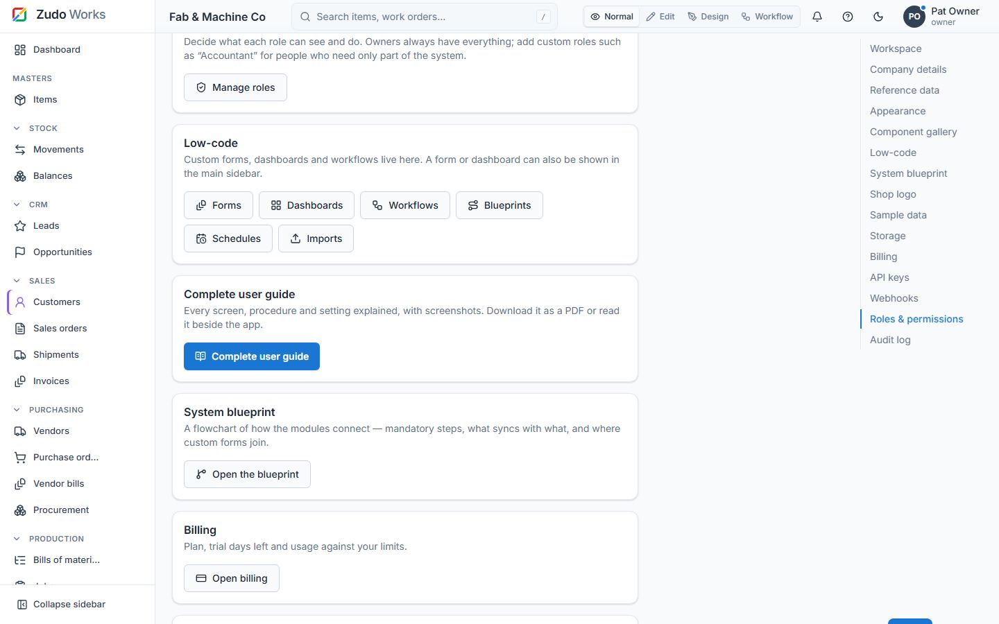
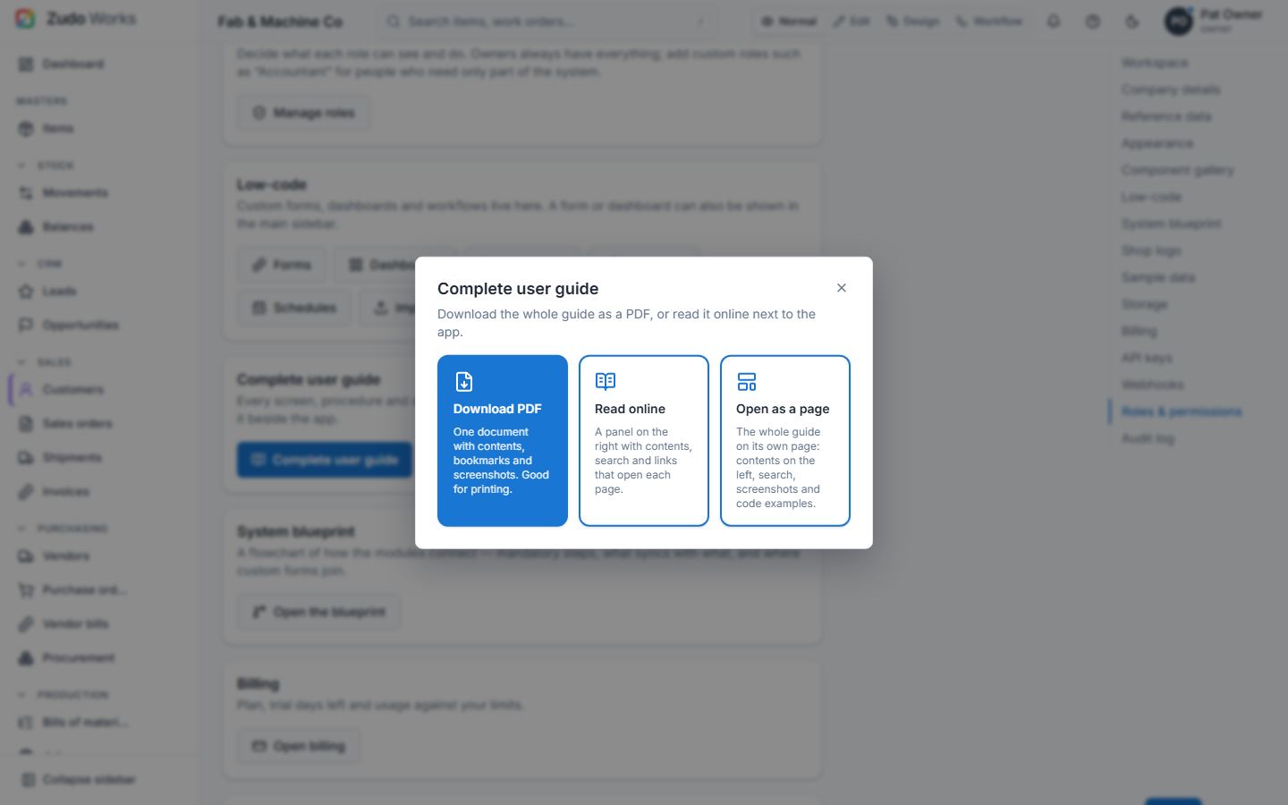
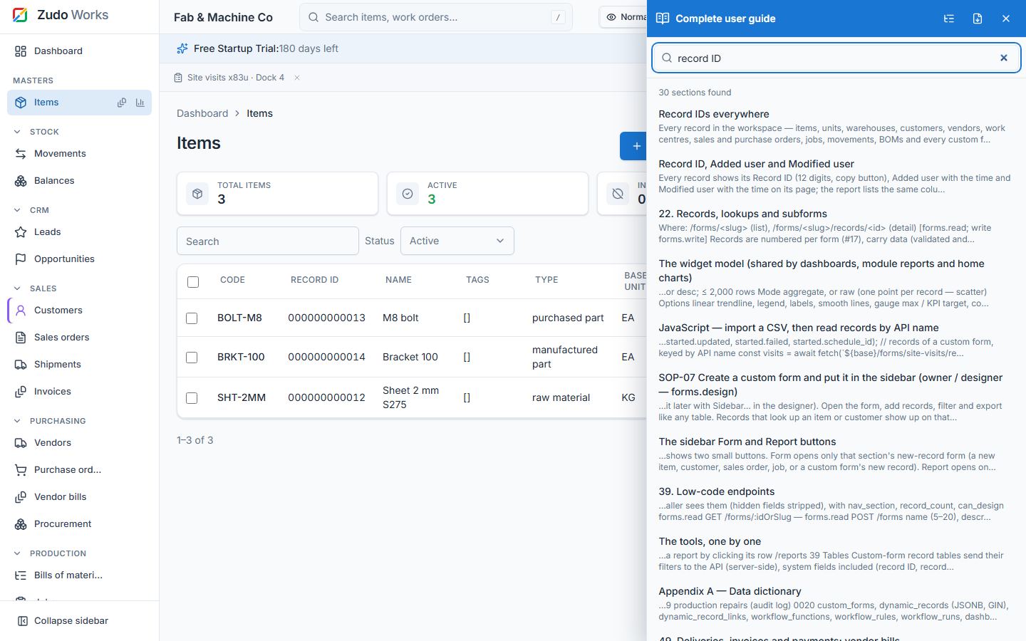
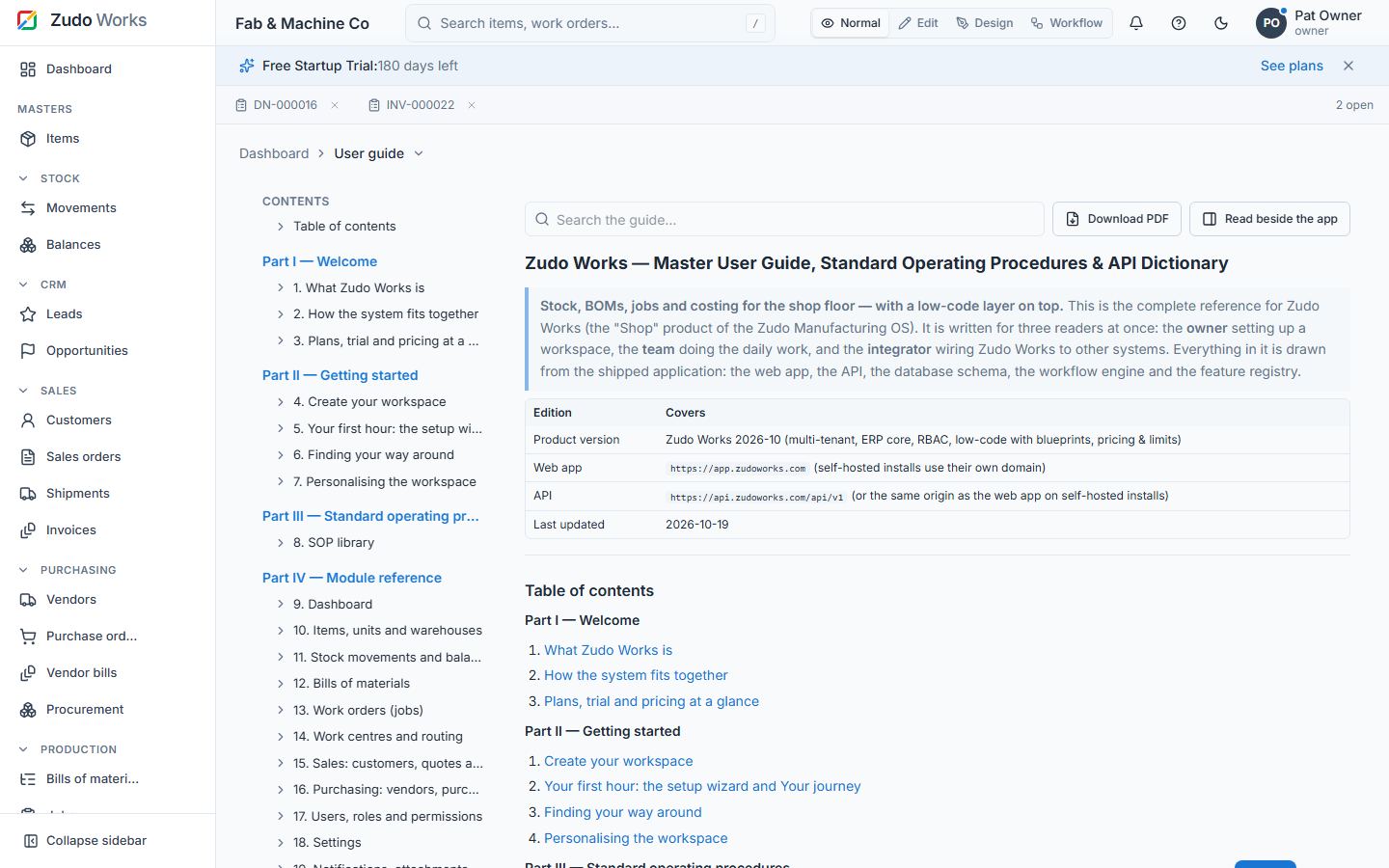
User menu → Complete user guide (and Settings → Complete user guide) offers three ways to read this guide: Download PDF (contents, bookmarks, page numbers and every screenshot), Read online — a panel on the right, 37 % of the window, with contents, search across every section, screenshots and links that open the page a section talks about while the guide stays open beside it — or Open as a page: the whole guide at /guide (also in the sidebar under Admin) with the contents on the left, search at the top, every screenshot, table and code example, and Read beside the app to switch to the panel. The same page is public at /docs, so you can link to a chapter (/docs#49-deliveries-invoices-and-payments-vendor-bills) from anywhere.
Last updated